a Minneapolis/St Paul based wedding photographer

LET’S CONNECT— I WOULD LOVE TO LEARN MORE ABOUT YOU!
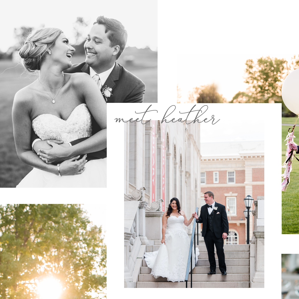
I’ll start! I’m Heather. I am a mother, wife, veteran, artist, go-getter, and a gal with an affinity for lists. Lover of memory-keeping, football, 70s music, and hygge. I prefer lunching over brunching and like to think of myself as a bit of a historian. (That may be overstating it a bit, but you might want me around if you need the yellow wedge in Trivial Pursuit.) I strongly believe that there’s never not a good time for ice cream and a good book. Most importantly of all, of course, is that I LOVE photographing weddings!
Now you! Tell me about you, your fiancé, and what makes your wedding day special. I can guarantee you we both have the same goal in mind—the chance for you to stay present in the moment and have FUN. Fill out the form below to get started.
Or, if you prefer, you can email, text, or call. I look forward to hearing from you!
